Responsive data tables with CSS Grid - Revisited
Published: 2018-06-04
This article aims to give an insight over CSS Grid and provide some examples how I’m making use of it in my daily work.
Disclaimer: The names used in the article are entirely fictional and any resemblance to reality is purely coincidental.
Grid Layout is a new CSS feature that allows the creation of beautiful and simple layouts with a system of columns and rows to make the design of web pages hassle free! It has support from all major browsers since October 2017.
I have become a fan of CSS Grid since I saw this awesome course by Wes Bos!
In one of the projects that I worked at Evodeck, I saw a shot to implement data tables using Grid Layout and decided to give it a try. I made sure to choose something smaller so we could have the chance to rollback or change to something else in a way that wouldn’t have a huge impact on the development process and the progress of the application.
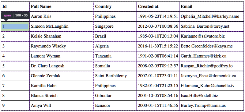
For visual purposes let me show a small example how easy it is to use CSS Grid. Bellow, we have a table built with some fictitious user data.
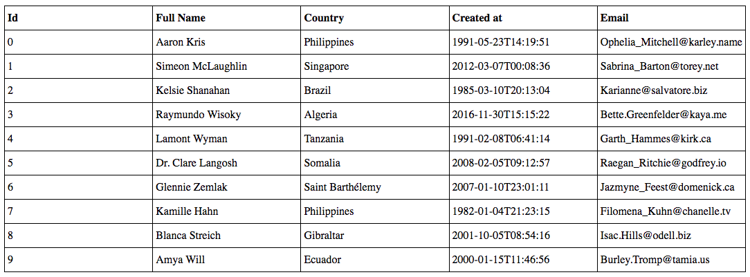
Snippet of the table HTML code
<div class="grid">
    <span>
        <strong>Id</strong>
    </span>
    <span>
        <strong>FullName</strong>
    </span>
    <span>
        <strong>Country</strong>
    </span>
    <span>
        <strong>Created at</strong>
    </span>
    <span>
        <strong>Email</strong>
    </span>
    <span>0</span>
    <span>AaronKris</span>
    <span>Philippines</span>
    <span>1991-05-23T14:19:51</span>
    <span>[email protected]</span>
    <span>1</span>
    <span>SimeonMcLaughlin</span>
    <span>Singapore</span>
    <span>2012-03-07T00:08:36</span>
    <span>[email protected]</span>
    <span>2</span>
    <span>Kelsie Shanahan</span>
    <span>Brazil</span>
    <span>1985-03-10T20:13:04</span>
    <span>[email protected]</span>
    ...
</div>
Guess how many lines of CSS code this table has?
CSS Styles to build the upper table
.grid {
display: grid;
grid-template-columns: repeat(5, 1fr);
border-top: 1px solid black;
border-right: 1px solid black;
}
.grid > span {
padding: 8px 4px;
border-left: 1px solid black;
border-bottom: 1px solid black;
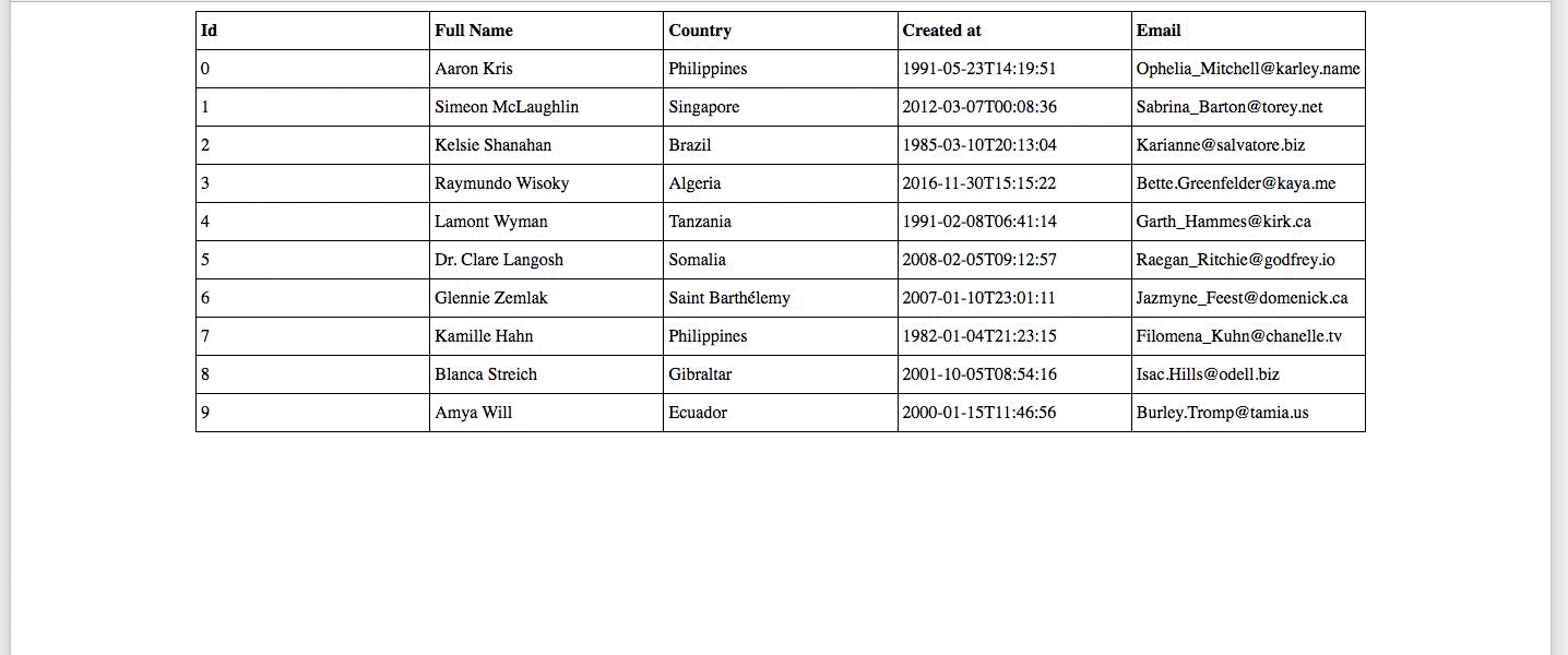
}12! That’s right only 12 lines of CSS and the magic happens on lines 2 and 3, it is there that we describe that the HTML element with a class of grid should display its content as grid and have 5 columns each with 1 fraction (1fr) of the available space! 😲 And with nothing else, it’s responsive by nature! I also used the CSS repeat() function, to know more about it, check it here.
Responsive CSS Grid

Alright, the magic expression “1 fr” means that the element will occupy one fraction of the available space! And that allows us to create columns with as many spaces as we need and remove the necessity to work with a fixed width!😮

Now imagine that we need to have the columns with different widths, all we need to do is to specify that, like this:
.grid {
    display: grid;
    grid-template-columns: 1fr 3fr 2fr 2fr 3fr;
    border-top: 1px solid black;
    border-right: 1px solid black;
}
By this, I mean
- let the “Id” column should take up 1 fraction of the available space;
- the “Full Name” and “Email” columns should take up 3 fractions of the available space;
- “Country” and “Created at” columns should take up 2 fractions of the available space;
The result is:
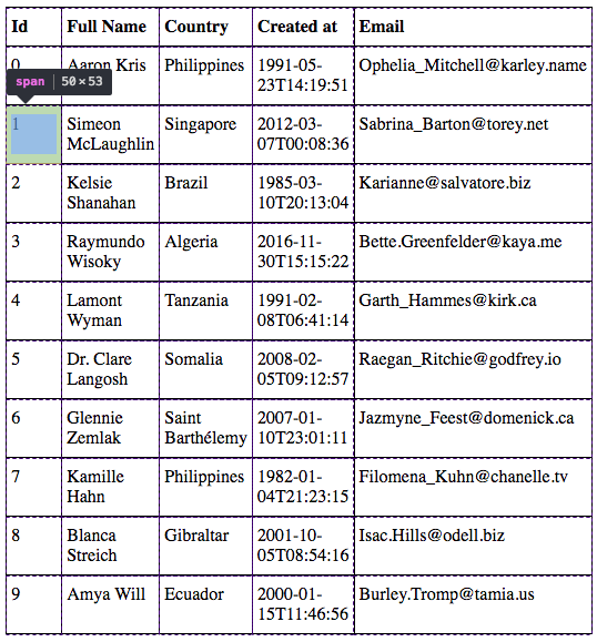
And we can do much more! If we want to work with fixed widths instead of fractions, we can also use the minmax() function. For example, if we want to have a fixed width in the first column with a minimum of 50px and a maximum of 100px, the code would look something like this:
.grid {
    display: grid;
    grid-template-columns: minmax(50px, 100px) 3fr 2fr 2fr 3fr;
    border-top: 1px solid black;
    border-right: 1px solid black;
}
And then, the final result is the one below:
While the most common use for CSS Grid is for building layouts with the grid-template-areas, I also find it very useful for tables!
Finally, a CodePen for this example, can be found at Responsive data tables with CSS Grid CodePen
In short, I found CSS Grid very useful and easy to work with and in my opinion, it does have a future and is something that will be very well adopted by the community!
I will not enter into details or discussions why you should choose Grid over Flexbox or Tables, I just chose to use the Grid simply because I found it very easy to work with, uses less code than the Tables, it’s less complicated than the Flexbox and finally it has a lot of functionalities out of the box, we just need to know how to take the most out of it! Like I usually say:
There is no such thing as a perfect tool, every tool has its advantages and disadvantages, so you should go with one that you feel comfortable with and solve the problem in the best possible way!
And as Phillip Sweet says, always be open to learn!
“Stay true to yourself, yet always be open to learn.”
-Phillip Sweet
I would like to share a couple of resources that I find to be very useful:
- A Complete Guide to Grid by CSS-TRICKS
- Reference to CSS Grid Layout in MDN web docs